DuFa Aalto Power Reserve

Today, we’re taking a look at a brand I knew little about, and one with some interesting designs.  I had run into DuFa occasionally via social media, but not much more.  Looking at their collection, I found their designs attractive and decided to give them a try.  From their already appealing collection, the Aalto Automatic Power Reserve design really spoke to me. 

 
No Power Reserve

No Power Reserve


The Watch

Like usual, below are the specs for those looking for quick information.
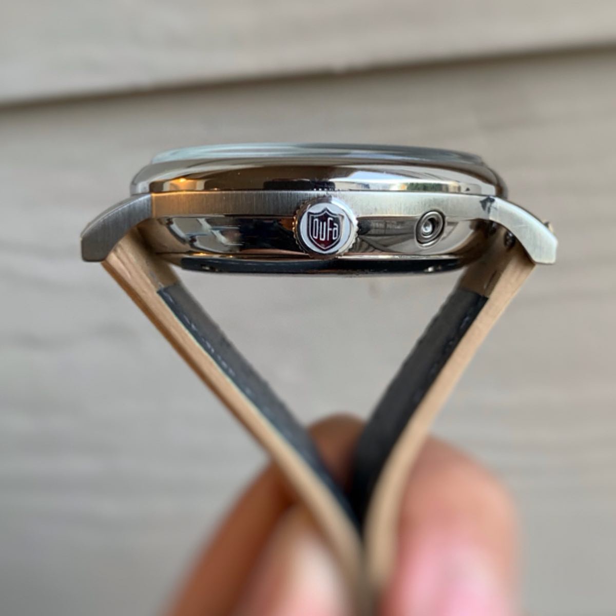
  • Diameter: 42mm

  • Thickness: 13mm

  • Lug Width: 20mm

  • Water Resistance: 30m
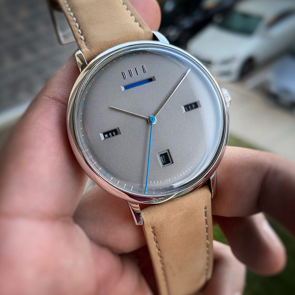
  • Dial: Grey

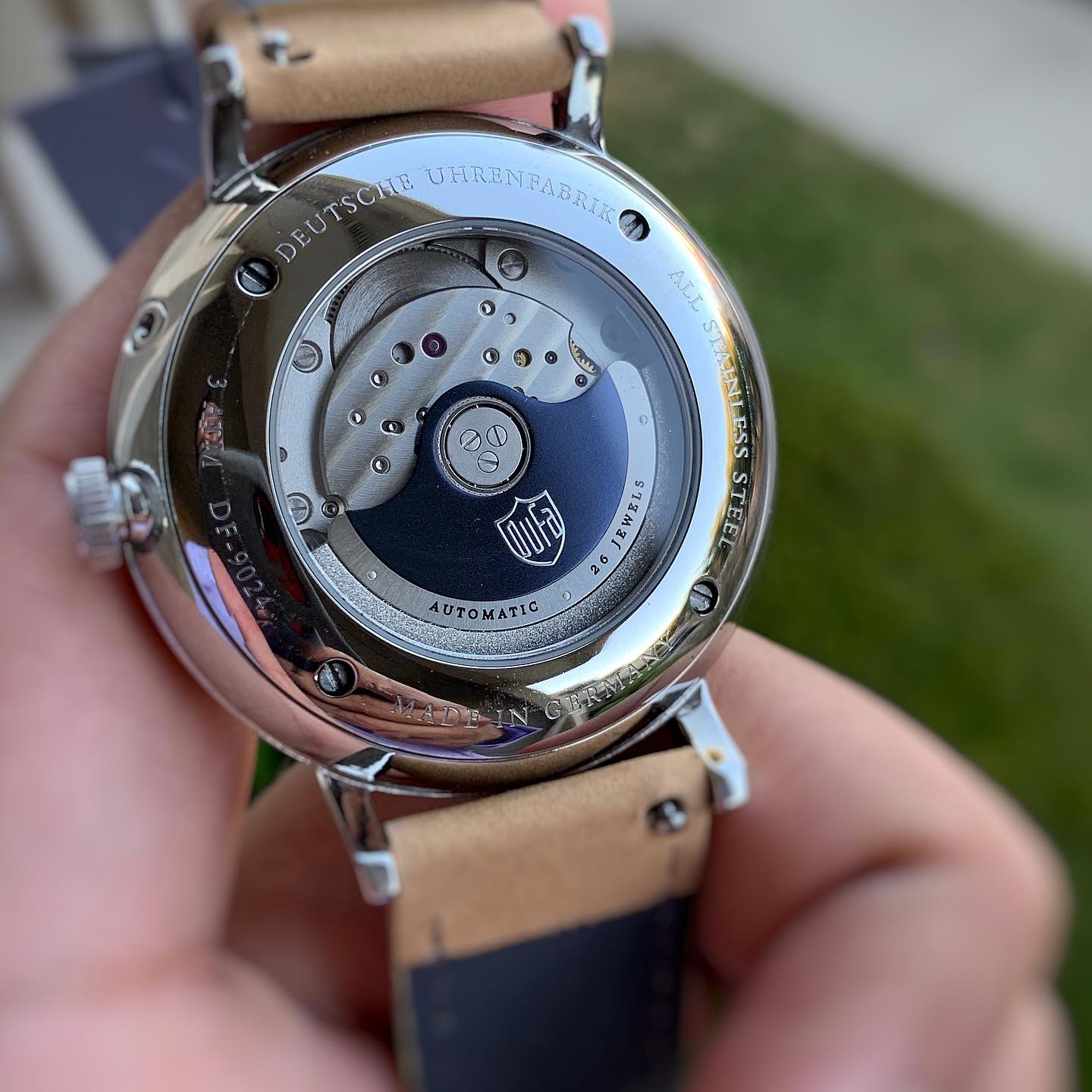
  • Movement: Modified Miyota

  • Complications: Day, Date, Month, Power Reserve

  • Strap: Leather

The meat of this watch is in its design.  Like I’ve talked about in other reviews, it’s difficult to toe the line between minimalist and plain boring.  In my opinion, this watch finds the perfect balance.  Whereas any other watch with this many complications would likely by incredibly busy, the Aalto was able to sneak everything in tastefully, with room to spare.  Color wise, the tones of blue and grey used blend beautifully together, creating a soothing design.  The other colors used in Aalto variations work just as nicely. The minimal text on the watch also goes a long way. With no text besides “Dufa” and “Made in Germany”, this is not a cluttered dial. 

Note: I have seen comments questioning the brand’s German affiliation.  I personally do not know the validity of these comments, but it may be worth checking this out, if you’re very interested in where a watch is made.  To me, it’s neither here nor there. A good design is a good design.  Moving on:

 
Full Power Reserve

Full Power Reserve


There are two clear highlights in this watch. First, the power reserve (PR) complication is done in a way that I had rarely (if ever) seen before. Most PR complications use a small needle, hand, or gauge, indicating visually (by pointing) how much power the movement has stored.  The Aalto, however, creates a “health bar” design, shading in the PR remaining.  It adds to the minimalist design well and shows the stored energy, in my opinion, more effectively than pointing at a certain number. This aspect of the watch was done very well.

The second highlight I found extremely pleasing was the lack of tail or counterbalance in the second hand.  This is something I’ve only seen on German watches (Stowa), but it certainly goes a long way.  I always say, “You never notice the counterbalance of a second hand until it’s gone.”  This small detail creates a very minimalist design, and of course, contributes to the overall theme of the watch.  Why this isn’t done by more brands, I’ll never know.  But it is certainly one of the coolest aspects of this watch, in my opinion.

 
DD6D2929-DBF0-4222-8FB8-4F517A2612F6.jpg


The Not so Good

One of the things I would change about this watch is the visibility of the PR.  The certain tone of blue used to indicate the stored power blends in with the grey dial. The result is a difficult to read PR complications, and it is something you have to go out of your way to see.  Two things on this point: First, I believe this is something specific to this color variant, as others I’ve seen create more contrast and more visibility. Second, at the end of the day, I don’t see this as a major fault.  To me, the PR complication serves more as an aesthetic complication, rather than one of utility.  If I am wearing a watch, I don’t really care how much PR is left on it, seeing that it is on my wrist and likely being wound.  To me, this complication serves as horological bragging rights that come with certain watches, not much more.  A difficult to read PR complication isn’t a big fault in my book, from a utility standpoint.

I would have liked to see this watch a tad bit thinner.  At 13 mm thick, plus a high crystal, this is a chubby guy.  While I would assume a modified Miyota movement adds some thickness to it, it’s something that would go a long way, had it been a bit thinner.

 
A0D8C901-76A9-4520-8023-976CDD7B6249.jpg


The Good

Like mentioned above, the watch’s design is unique and very well executed. This alone is a selling point. In a crowded minimalist market, not many watches can say they have a truly unique design.

The other (positive) side of my gripe regarding the thickness of the watch is the high sapphire crystal.  While it adds to the thickness, a big dome crystal is always appreciated.

Finally, I am personally a fan of the font type used on all of the complications. It blends well with the design and contributes to the minimalist design.


693F4FD9-9149-489C-A17D-EC9F1CCC6B95.jpg
 

The Verdict

The Aalto piqued my interest and kept up with my expectations.  Like mentioned above, finding a unique design in this market is tough; and finding one that lives up to the hype is even harder.  This is a well-executed watch by DuFa.


Below is an unboxing video that shows what you get when you buy this piece.